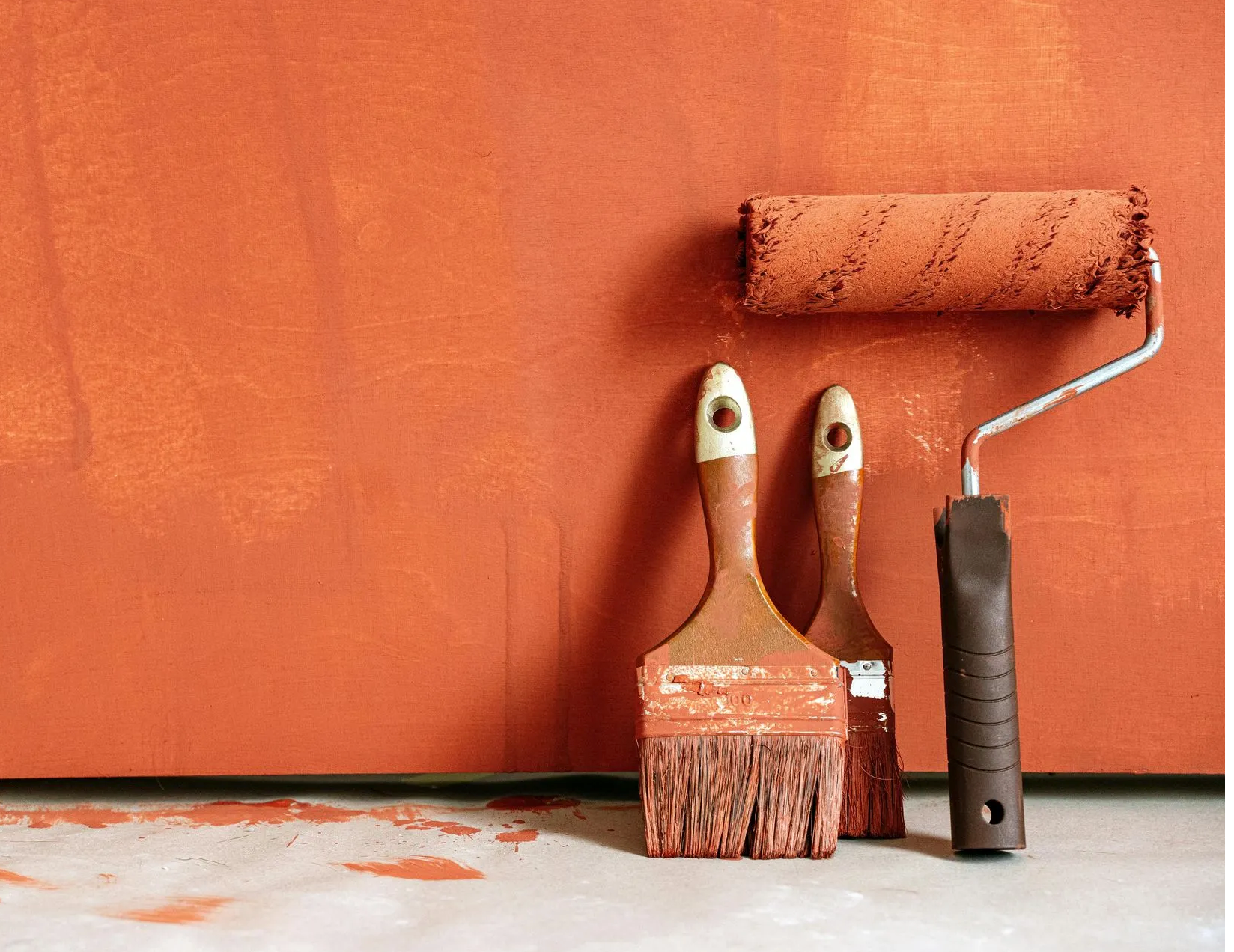
How To Pick The Best Paint Colours for Every Room in Your Home
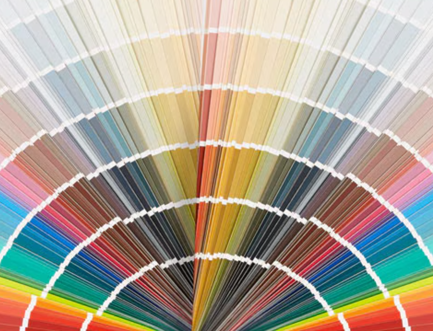
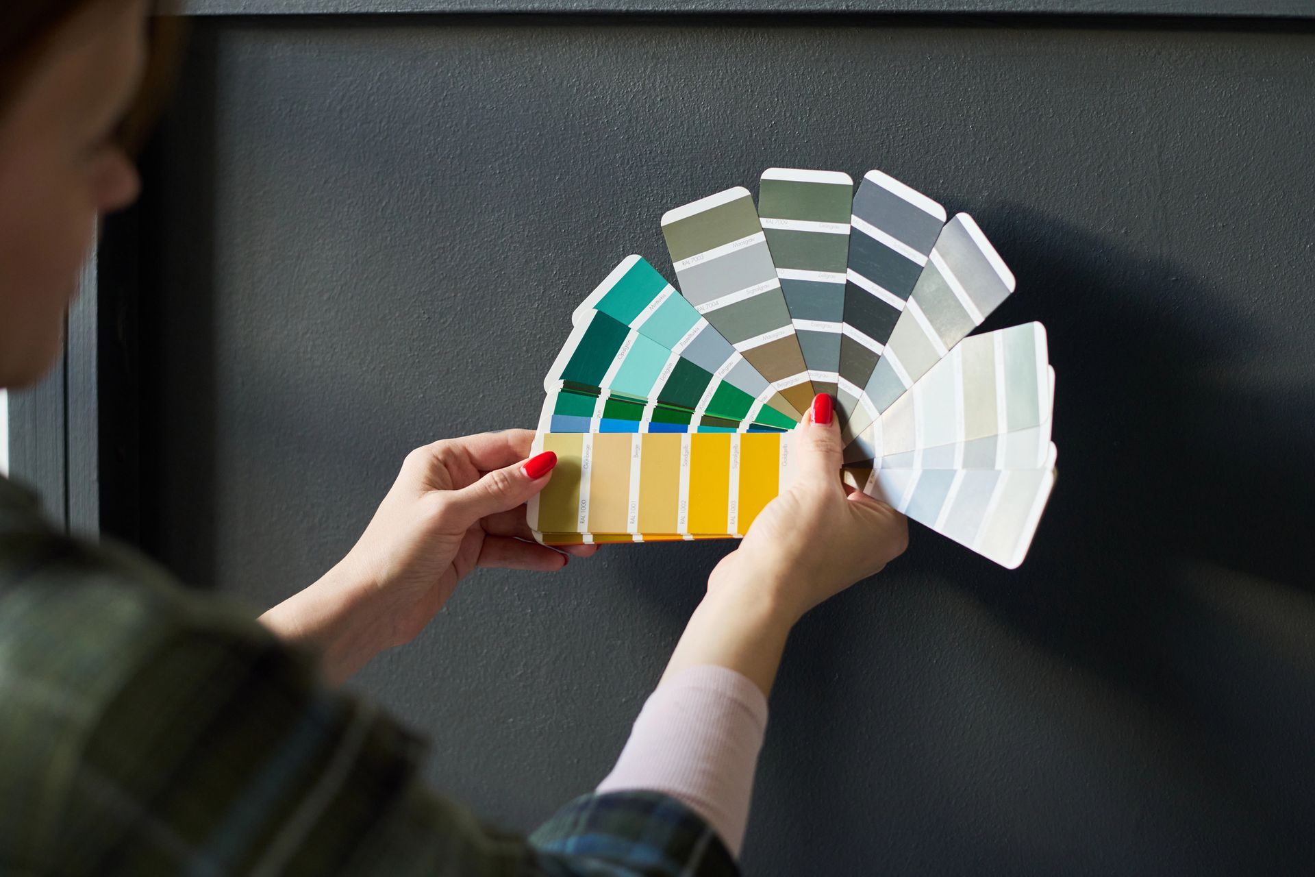
Choosing the right paint colour has the power to transform a space. It sets the mood, enhances natural light and ties your entire room together. With thousands of shades to pick from it's easy to feel overwhelmed. But when you align colour with purpose and emotion you can create a home that feels balanced, beautiful and unmistakably yours.
Here’s how to choose the perfect colour for every room in your home.
Living Room Paint Colours That Create a Serene Gathering Space
The living room sets the tone for your home. It’s where people gather, unwind and spend quality time so it deserves a colour palette that feels both comforting and welcoming.
Warm Neutrals for a Relaxed Atmosphere
The living room is where life happens. It’s where conversations unfold, where you unwind after a long day and where you host your favorite people. Soft warm neutrals like dove gray beige and greige provide a calming base that evolves throughout the day as the light shifts. These shades feel timeless and adaptable giving your space a grounded comfortable feel.
Muted Jewel Tones for Character
To add personality without disrupting the calm, consider muted jewel tones like dusty teal or olive green. These colours work beautifully in accents such as pillows rugs or statement pieces and bring subtle richness to the room while maintaining harmony.
Kitchen Paint colour Ideas That Spark Energy and Style
Your kitchen should feel alive with energy and warmth. Whether you’re cooking, hosting or grabbing a quick bite colour plays a huge role in shaping how this space feels and functions.
Light colours for Bright Airy Spaces
Kitchens are full of movement and activity which calls for colours that energize and uplift. Crisp white cabinetry reflects light and instantly opens up the room making it feel larger and more inviting. For a touch of warmth try buttery yellow or soft chartreuse to bring in a sense of sunshine and freshness.
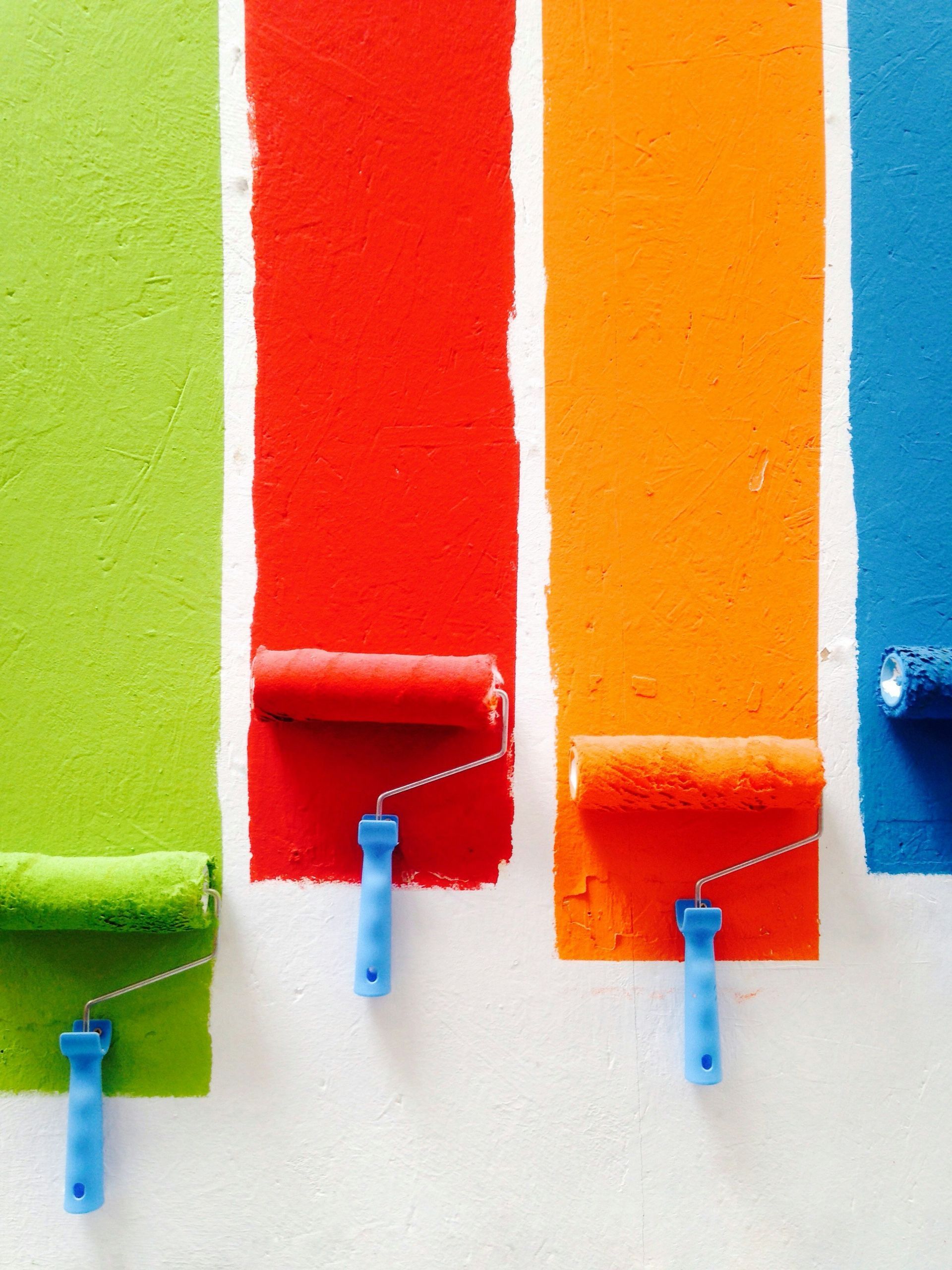
Bold Accents for Visual Impact
If you're looking to add depth a navy or charcoal kitchen island adds bold contrast especially when paired with brass fixtures or natural stone countertops. High-gloss finishes reflect more light and are easy to clean while matte finishes offer a modern muted elegance and help mask daily wear.
Best Bedroom Paint colours for Restful Sleep
The bedroom is your personal escape at the end of each day. The right colour choice can help create a restful soothing atmosphere that supports better sleep and relaxation.
Soft Cool Tones to Soothe the Mind
Bedrooms should feel like a retreat. Soft shades like sea-glass green misty blue and pale lavender are known to reduce mental clutter and encourage deeper rest. These gentle hues help create a space where you can truly relax and recharge.
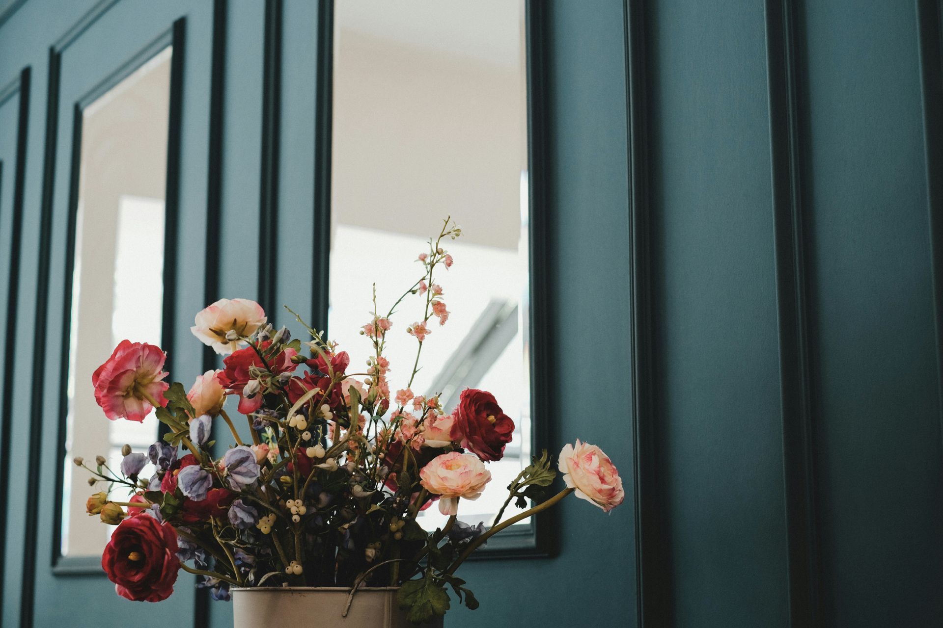
Darker Hues for a Cozy Finish
For a dramatic yet comforting look consider a navy or forest green accent wall behind the headboard. These deeper tones create a cocoon effect without overwhelming the room especially when paired with light bedding, natural woods and soft textures.
Top Bathroom colour Choices for a Spa-Inspired Look
Bathrooms may be small but their colour can have a big impact. With thoughtful choices you can turn a purely functional space into one that feels calming, clean and spa-like.
Light Reflective Shades to Open the Space
Bathrooms often lack natural light so colour should work to brighten and expand. Pure white and pale gray reflect light and help small bathrooms feel more spacious. Use semi-gloss or high-gloss finishes for durability and moisture resistance especially around sinks and showers.
Nature-Inspired Greens for Calm
Introduce soft greens like eucalyptus or mint to echo nature and add a spa-like quality. These shades pair beautifully with white towels, simple hardware and organic textures bringing peace and clarity to your daily routine.
Home Office Paint colours That Enhance Focus and Creativity
Working from home requires a space that helps you stay clear-minded and motivated. Choosing colours that balance focus with inspiration can make a noticeable difference in your day.
Cool Neutrals for Clarity and Concentration
In a home office setting colour needs to support focus without being distracting. Sky blue and sage green are excellent choices for promoting mental clarity and reducing stress. They create a balanced backdrop for productivity whether you're on calls or deep into a project.
Creative Boosts with Warm Accents
To spark fresh thinking, consider warm accent touches. Coral wall art or a terracotta desk lamp can subtly energize the space without pulling attention away from work. The right combination of calm and vibrancy helps maintain motivation and creative flow.
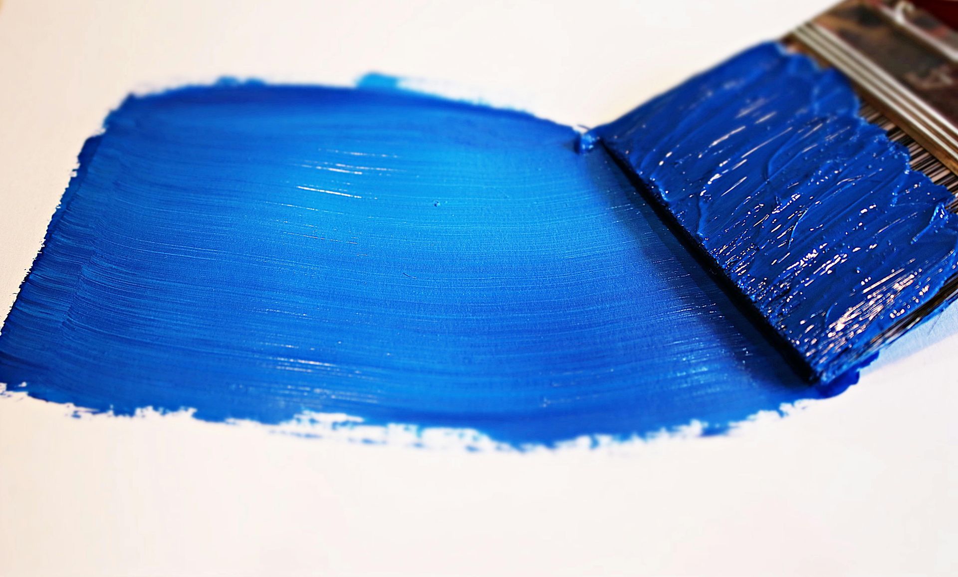
How to Choose Paint colours That Reflect Your Style
Bringing your home together starts with understanding how colour influences mood, light and space. A few smart tips can help you choose shades that truly reflect your personal style.
Test in Natural Light
Before committing, test paint samples on multiple walls and observe how they look throughout the day. Natural light changes from morning to evening and can completely shift the tone of a colour. This step ensures the final result aligns with your vision.
Match Mood to Function
Each room serves a different purpose. Calm tones are ideal for resting areas while lively or warm hues work better in social and task-oriented spaces. When colour is chosen with intention the entire home feels more cohesive and emotionally connected.
Final Thoughts
The best paint colours do more than look good. They make your home feel just right. Whether you're drawn to soft neutrals, rich jewel tones or light reflective hues, choosing the right shade starts with knowing how you want each space to feel.
When you're ready to explore new colours take the guesswork out of the process by visiting
Crowfoot Paint and Design. With a wide selection of
quality paints and expert guidance you'll find the perfect match for every room in your home.